
Chapter Demonstrable Skills
After completing the Excel Chapter 3 portion of the Excel & Data Analysis unit, students will be able to:
| Demonstrable Skill | Learning Activities & Informal Assessments |
Formal Assessments (excluding Exams) |
|---|---|---|
| Create charts to illustrate data. |
|
|
| Manipulate the size and placement of charts. |
|
|
| Format chart elements such as titles, axes, and legends. |
|
|
| Modify and switch data series plotted on charts. |
|
|
| Insert sparklines to illustrate data. |
|
|
Chapter Notes
Charts
Charts are pictures that we use to quickly and efficiently convey data [1]. The Chart Area contains the entire chart and all of the elements. A Region containing the graphical representation of the values in the data series is called the plot area. A Data Series is a group of related data points.
The X-axis is a horizontal border that provides a frame of reference for measuring data horizontally. The Y-axis is a vertical border that provides a frame of reference for measuring data vertically. The Category Axis displays group names or labels to identify data.
The Value Axis displays incremental numbers to identify the values that are used to create a chart. A Legend is a key that identifies the color or pattern assigned to each data series in a chart.
The most commonly used type of charts in CS101 are scatter and line charts. With scatter and line charts, you can identify trends with trendlines. They also allow you to make projections forward into the future.
Trendlines
Using the R2 value, try to create a trendline that comes close to a value of 1.0 and accurately reflects where you think the data is headed [2].
For example, it's possible to create a trendline with an R2 value close to 1.0 for the price of gas that projects a negative value for gas in the future. Since that's not likely to happen, you'll want to try different types of trendlines to see what best matches your prediction.
Tips & Tricks
Charts
One more note on Homework #2 [2]: If you have a chart that looks like this, it's wrong:
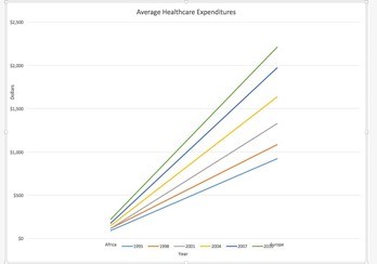
What you want to do is click to make the chart active by clicking anywhere on a blank place in it.
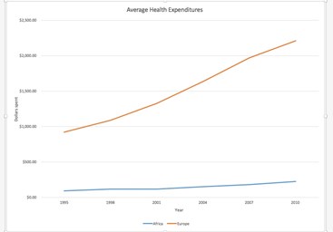
Click the contextual menu for charts that is in the ribbon above. Click on Switch Row/Column. You'll then have two lines (Europe and Africa) to work with. So before the trendlines, it would look like this:
Calculated column issues
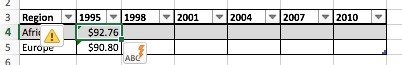
One more thing. If you enter a value for one row (like Africa in the Healthcare Expenditures Problem) and it AutoFills for a different row, click the lightning bolt ToolTip and select the Stop Automatically Creating Calculated Column option [2].
References
- A. Poatsy, K. Mulberry, C. Krebs, L. Hogan, A. Rutledge, and E. Cameron, Exploring Microsoft Office 2013, 1st ed., vol. 1. Upper Saddle River, NJ: Pearson Education, 2013.
- R. G. Phipps and B. M. Powell, “Excel Chapter 3,” Computer Science 101, May 18, 2016. Available: http://cs101.wvu.edu/materials/units/excel-data-analysis/excel-chapter-3/.