
Assignment Files
Submissions
You must submit your completed file(s) through the CS101 Submit Assignments tool.
Due Date
This assignment is due on Thursday, February 6, 2025. For on-campus sections, it is due by the end of class. For online sections, it is due by 11:59:59 PM Eastern Time. Late work will not be accepted.
Grades
This assignment is worth 8 points. A grading rubric is provided at the end of the assignment instructions. Over the entire semester, students must complete at least 20 Participation Projects to earn a maximum of 160 points.
Help & Resources
Video
This video is also available on YouTube [1].
Assignment Notes
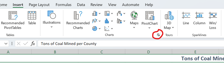
In Excel, charts can be found on the Insert ribbon. While it's tempting to use shortcuts for specific charts like line graphs, it’s best to click on "Recommended Charts" or the specific chart icon to ensure you're inserting the correct one. If Excel automatically graphed years as data rather than axis labels, you can try a different chart type.

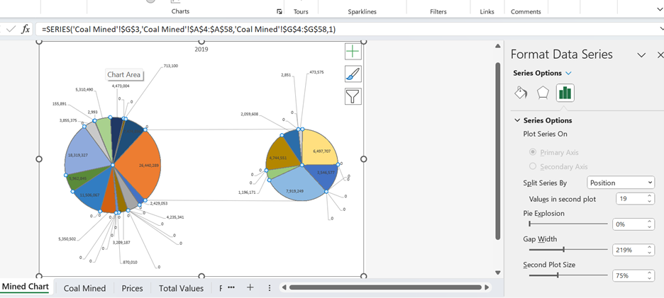
Hovering your mouse over each option will reveal the chart name, which is helpful when selecting specific types like the "pie of pie" chart for certain data visualizations.

If you're unsure how to format or adjust a chart, right-clicking on the chart is a great starting point. Each part of the chart offers different formatting options based on where you click. For example, clicking on the chart’s data series gives options for formatting the data, while clicking on the axes opens a different set of formatting tools. The green plus sign in the top-right corner of a chart allows you to add or remove elements like the legend, axes, or gridlines. To format these elements, right-click and choose "Format [element]." The formatting menu will stay open until you close it, and you can switch between different menus by selecting different parts of the chart.

As I already mentioned, sometimes, when creating line charts, Excel may place the years as data points rather than on the horizontal axis. If this happens, don't worry. You can correct this by selecting the chart and using the "Switch Row/Column" option under the Chart Design ribbon. This often fixes the issue and repositions the data correctly.

Reminders
For formulas that appear as text instead of results, check for an accidental space before the equal sign. Simply delete it in the formula bar. If you see a #VALUE or #ERROR error, it might be due to a line break or extra space in a copied formula. Click on the formula bar and remove the extra line break to fix this.
Right-clicking is a powerful tool in Excel; if you can't find what you need, right-clicking often reveals the relevant options. If you're asked to format something within a chart, right-clicking the element will bring up a formatting menu on the right. For specific formatting like number options on an axis, select "Format Axis," then adjust the "Numbers" section to fit your needs.
For this particular project, using the "pie of pie" chart might be useful when dealing with small data values. This chart allows a subset of values to be displayed on a smaller pie chart next to the main one. To customize this, right-click on the pie chart and select the "Format Data Series" dialog box. You can adjust the "Split series by" setting to control how the data is divided, with instructions specifying what to use for the split.

Trendlines in line charts can be added by right-clicking on the data series, ensuring the chart is a 2-D line, and selecting "Add Trendline." Afterward, you'll see a dotted trendline. The dialog box on the right will allow you to pick the trendline type (1), project it forward (2), and display the r² value (3). When evaluating trendlines, consider both the r² value and whether the trendline realistically matches the data. Avoid using moving averages, as they are rarely appropriate.

R Value
The r value measures the strength and direction of the relationship between variables. It ranges from -1 to 1, with values closer to 1 indicating a stronger relationship. Positive r values show that both variables change in the same direction, while negative values indicate the variables change in opposite directions. The r² value, which ranges from 0 to 1, shows how well the regression line fits the data. A value closer to 1 means a better fit, but it's important to use judgment, as certain trends may yield unrealistic predictions.
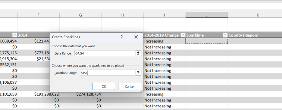
Lastly, when working with sparklines, first select the Location Range where the sparkline will appear. The Data Range is what the sparkline will be based on, and you can adjust this if Excel defaults to the wrong range. Once the sparkline is inserted, you can autofill it down for other cells.

Associated Learning Objectives
This assignment covers the following course and unit learning objectives:
| Number | Learning Objective |
| C01 | Build spreadsheets to perform calculations, display data, conduct analysis, and explore what-if scenarios. |
| C05 | Identify, access, and evaluate information to solve real world problems. |
| C01.ED02 | Create and manage workbooks, worksheets, and their data. |
| C01.ED06 | Use charts, PivotCharts, and sparklines to present data in a graphical format. |
| C01.ED07 | Use what-if analysis tools to project future values and prepare different scenarios. |
| C05.ED01 | Locate and access data and resources necessary to solve problems. |
| C05.ED08 | Interpret and analyze spreadsheet data. |
References
- B. M. Powell, Excel: Charts Participation Project. West Virginia University, 2021. Available: https://www.youtube.com/watch?v=8ytiEGRk47s.